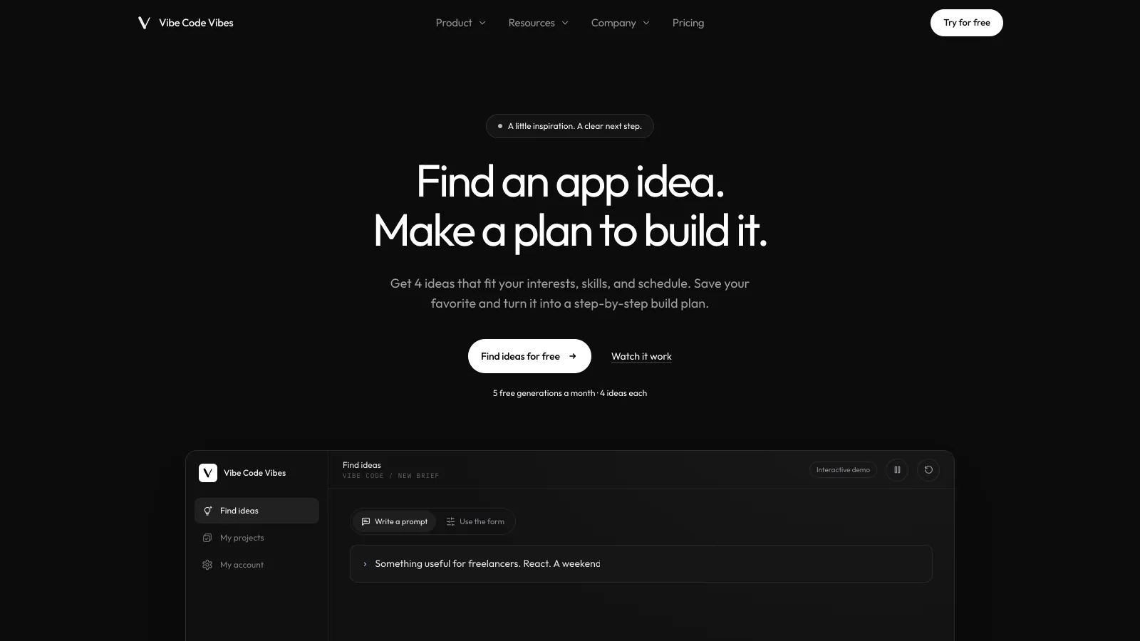
Code your vibes into reality
- Project
- Vibe Code Vibes
- Services
- Brand Identity, Web Design, UI/UX, Development
- Year
- 2026
- Type
- AI web application
Vibe Code Vibes / Brand, website, and web app
Brand, website, and app.
Designed and built as one.
Vibe Code Vibes is an AI side project generator: someone shares what they are into and how much time they have, and it returns four project ideas with a plan to build one. The challenge was making an open-ended AI tool feel approachable, trustworthy, and worth coming back to.
I designed and built all of it: the brand identity, the marketing website, and the signed-in web application, from the first sketches of the idea flow to the database, payments, and AI integration behind it.
The project brings together brand identity, web design, UI/UX design, and web application development by Eight84.
• The UX approach
A big question,
small decisions.
“What should I build?” is hard to answer from a blank text box. I broke it into a short sequence of low-stakes choices: set a few preferences, compare a short list, then commit to one idea and plan it. Each screen shows only what that decision needs.
- 01
A brief that reads like a sentence.
Instead of a long form or a blank prompt, the brief is one sentence with five fill-in pills. It sets a direction in seconds and still feels conversational.
- 02
Four options, never forty.
Results stop at four comparable cards with the same details in the same places, so people can make a decision instead of scrolling.
- 03
One idea, carried forward.
Saving an idea turns it into a project with a stage, progress, and a next step, plus a written prompt that hands the context to an AI coding tool.
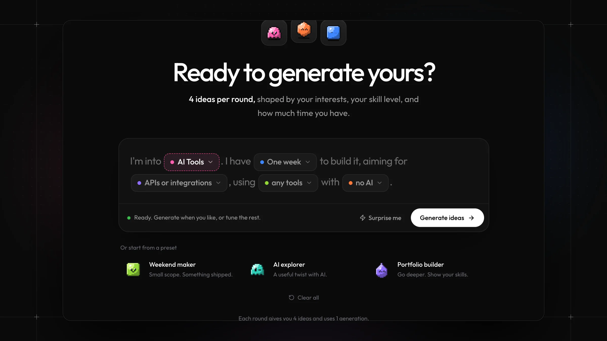
Designing the brief.
Each blank in the sentence is a colored pill that opens a short, focused list. The Generate button stays muted until there is enough to go on, so the interface guides without blocking.
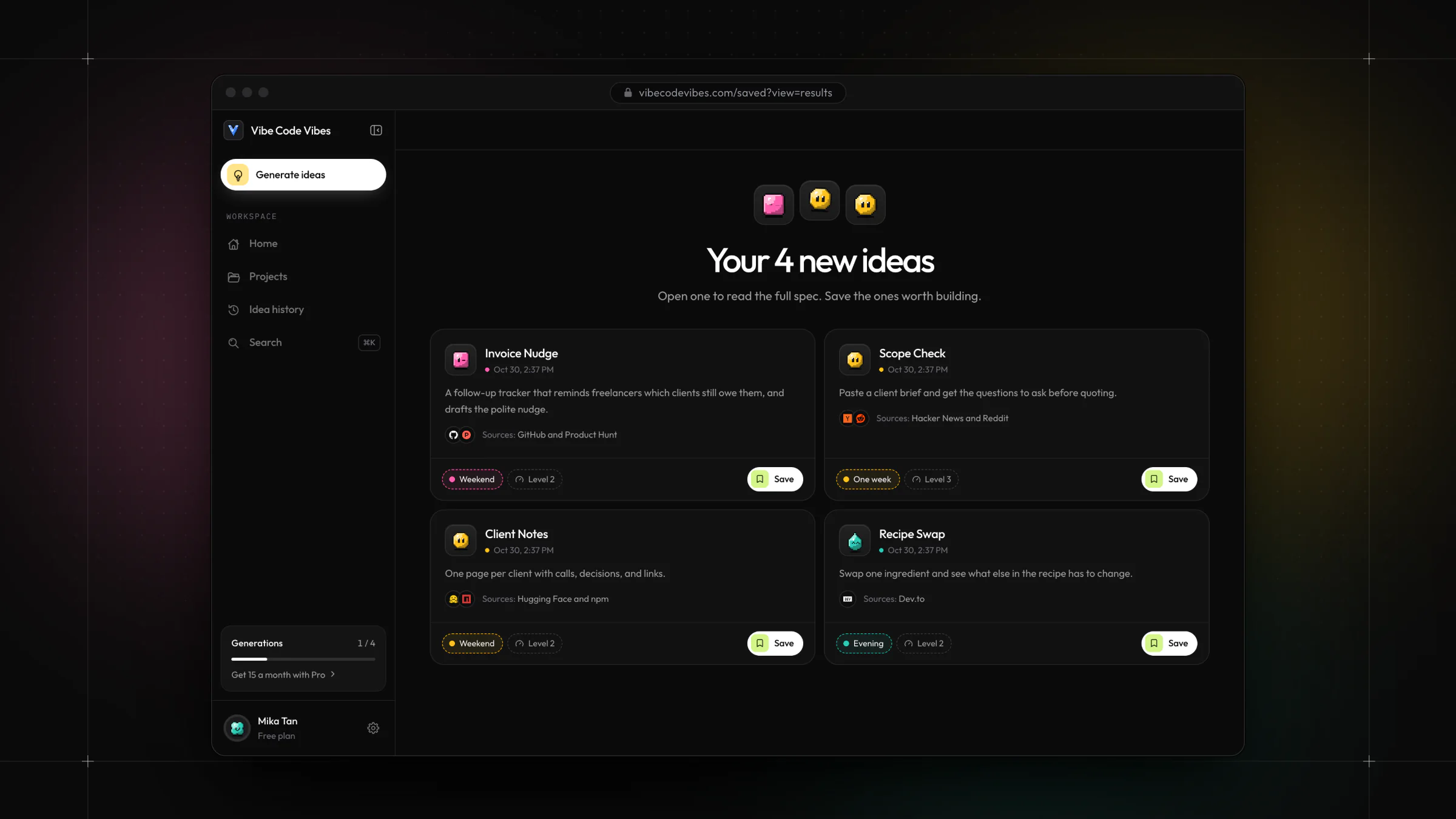
Designing for comparison.
Every idea card follows the same structure: pitch, sources, build time, and difficulty, with one clear action. That consistency makes four ideas quick to scan side by side.
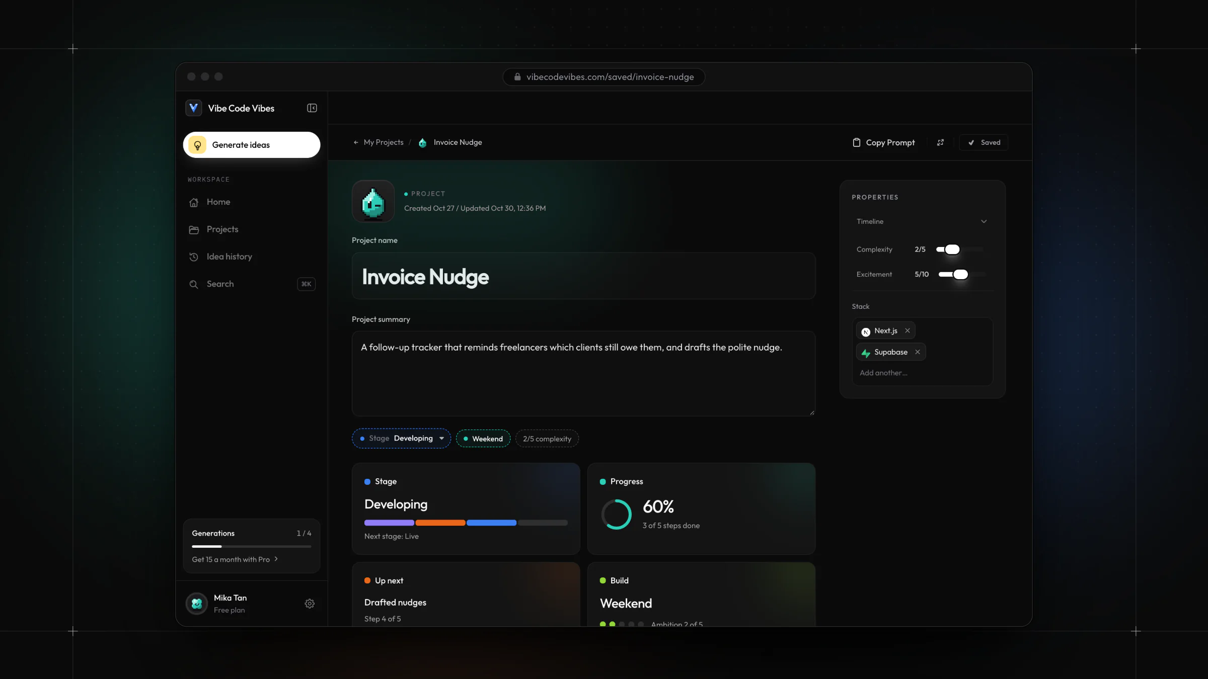
Designing for follow-through.
A saved idea becomes a project page that leads with status: stage, progress, and the next step, with properties and the stack kept to one side.
• The workspace
A workspace that
keeps the thread.
Signed in, the product becomes a workspace, and I designed it around return visits: a home that shows where each build stands, a pipeline for saved projects, and a history of every idea. It shares the website’s dark surfaces, pills, and characters, so the step from marketing site to product feels seamless.
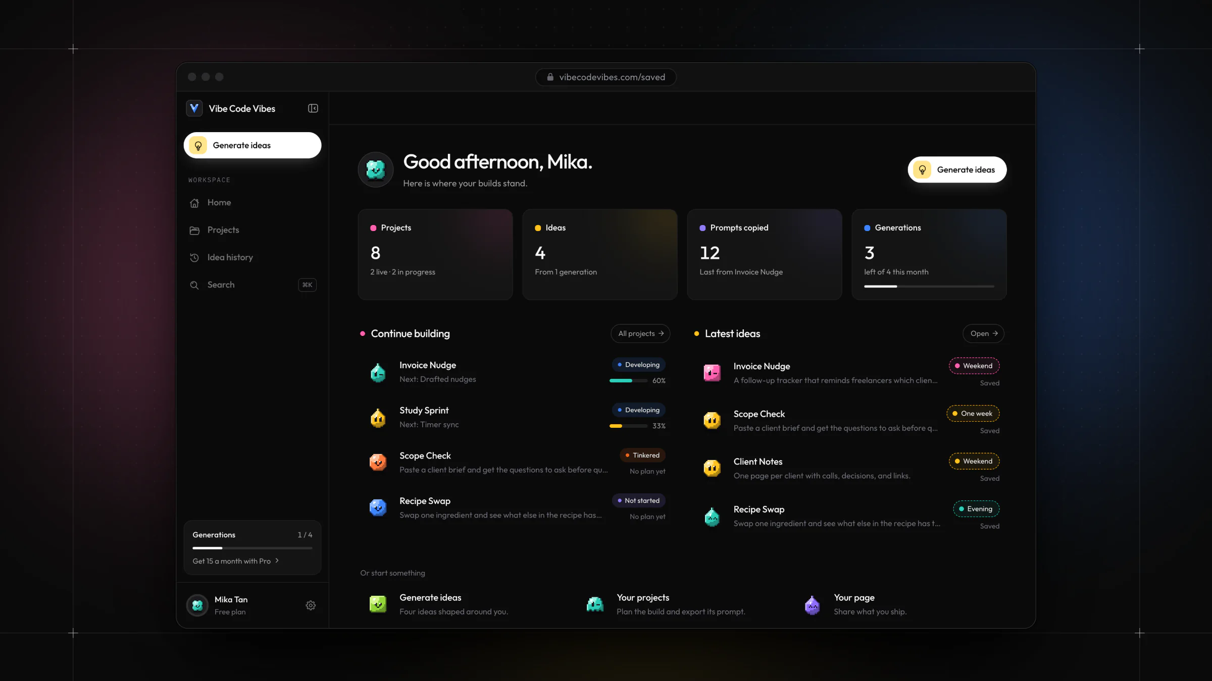
A home built for coming back.
The home screen answers “where was I?” first: four stat tiles, projects in progress with their next step, and the latest ideas, with the primary action always in the same place.
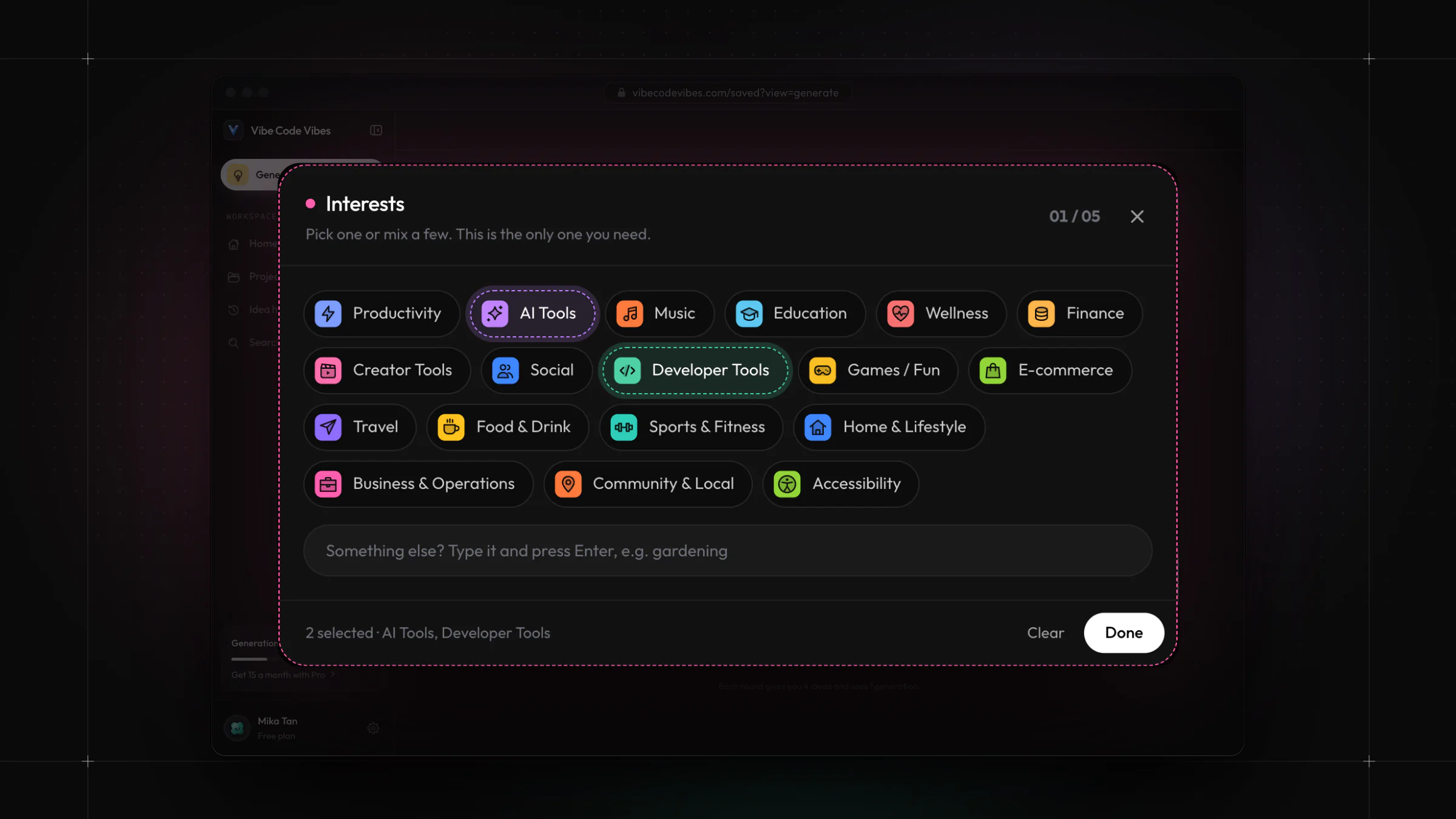
Long lists, kept friendly.
Eighteen interests could easily become a wall of checkboxes. Color-coded pills with icons keep the list scannable, allow a mix, and leave room to type something custom.
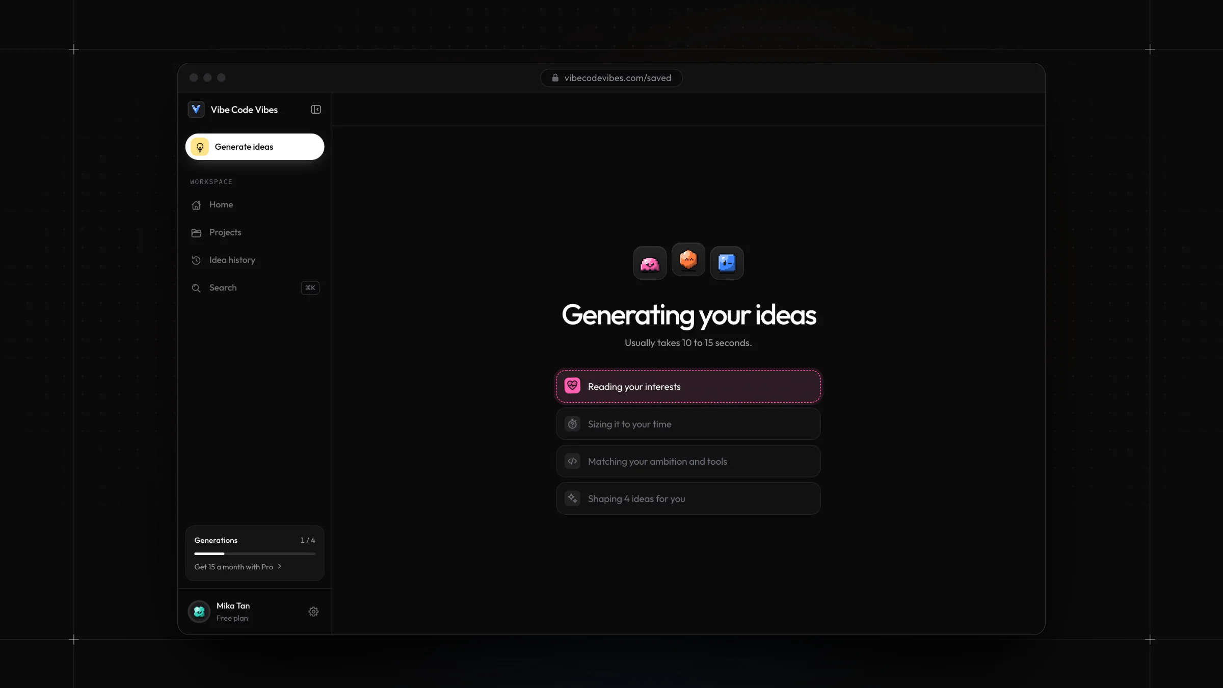
Making the wait feel shorter.
Generation takes 10 to 15 seconds. Instead of a spinner, the loading screen narrates each stage, which sets expectations and shows what the AI is working on.
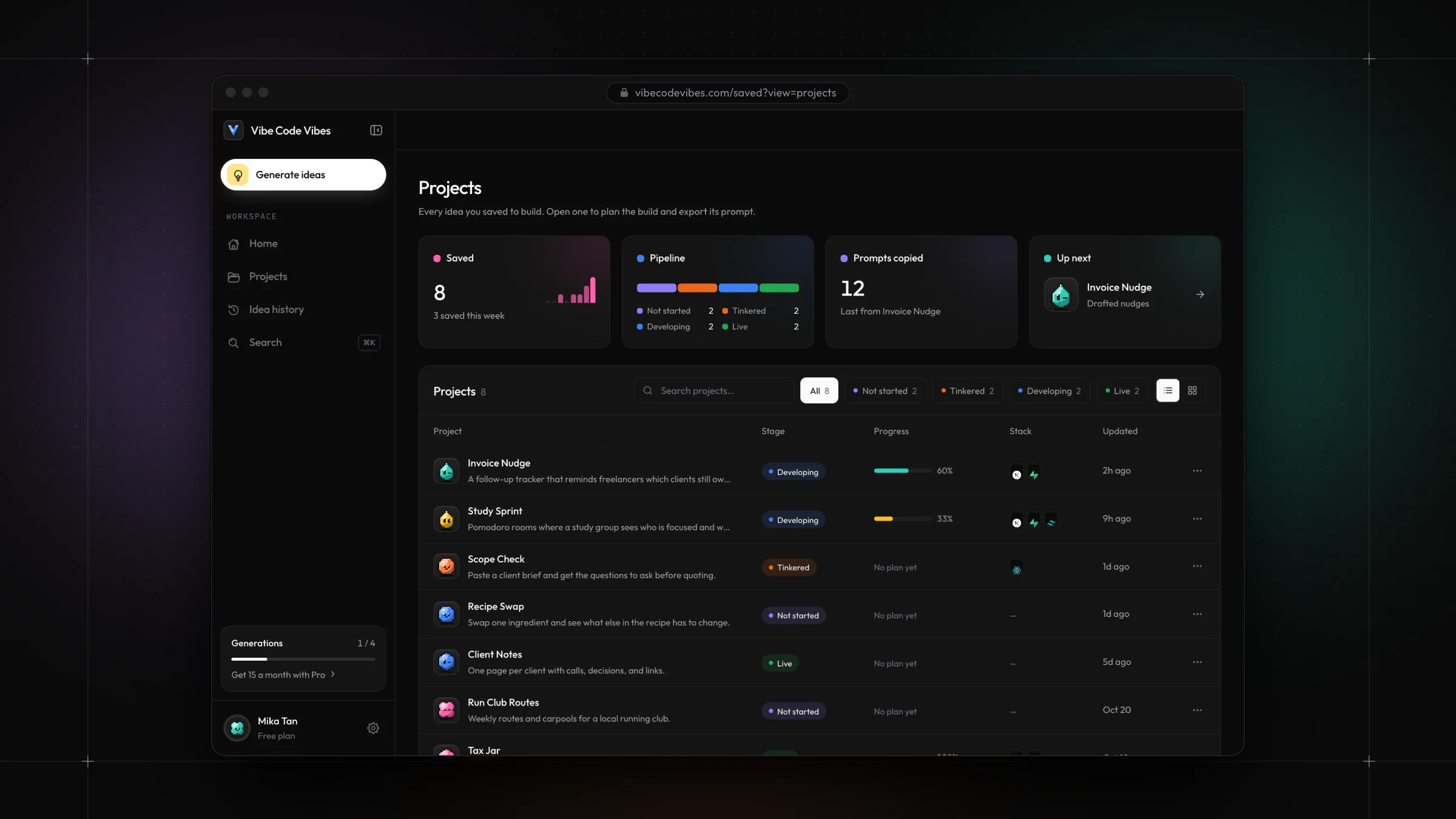
Status at a glance.
Projects move through four stages, from not started to live. A color-coded pipeline, progress bars, and filters keep a growing list easy to manage.
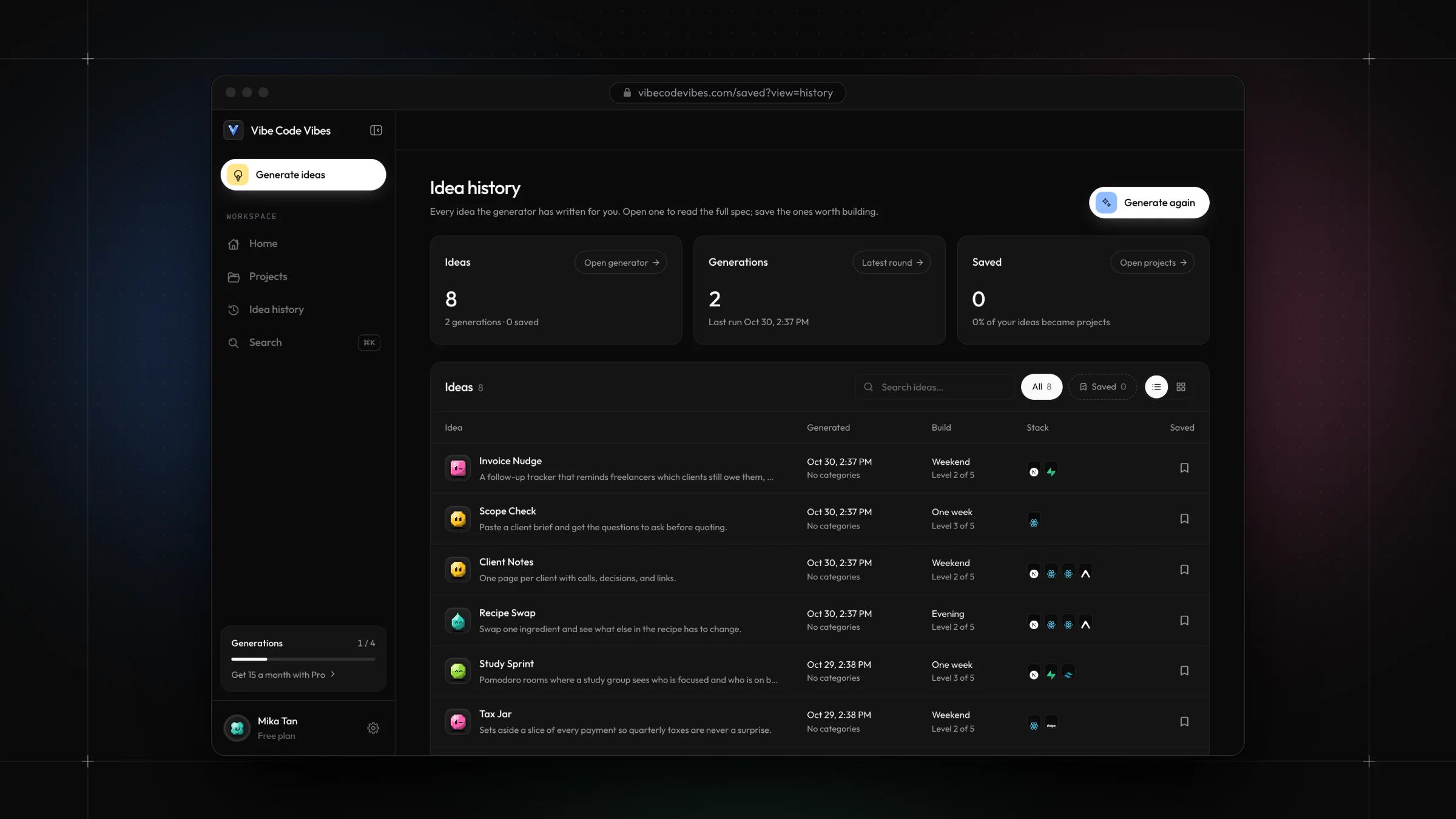
Nothing gets lost.
Every round the generator writes is kept in a searchable history, so an idea passed over today is still there next week.
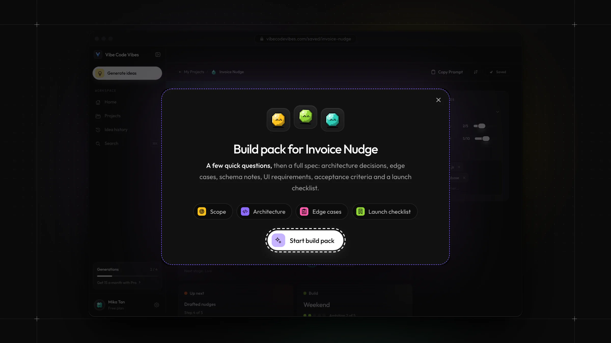
Depth only when it is wanted.
Detailed specs are optional. A short question flow produces a full spec, with architecture decisions, edge cases, schema notes, and a launch checklist, once someone is ready to commit.
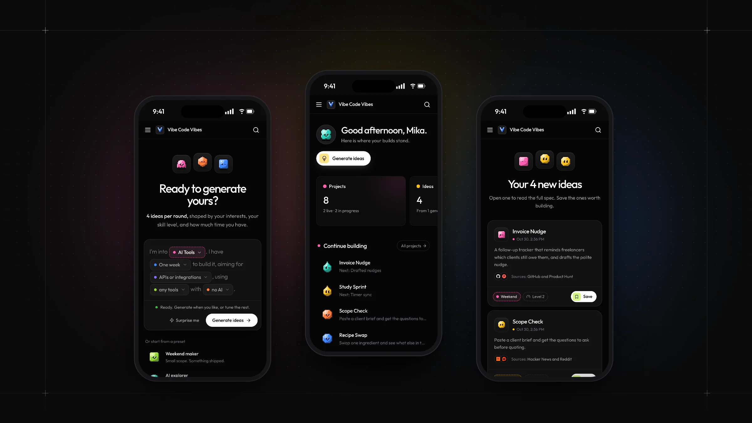
Responsive from the start.
The generator, workspace home, and results were designed for phones alongside desktop, keeping the same pills, tiles, and characters at every size.
• The brand
A cast of
pixel characters.
The brand needed to feel playful enough for side projects and credible enough for developers. I paired a pixel V logo and clean geometric type with twelve small 8-bit characters and a set of category colors. Together they bring warmth to a dark, technical interface and carry from the website into the product.
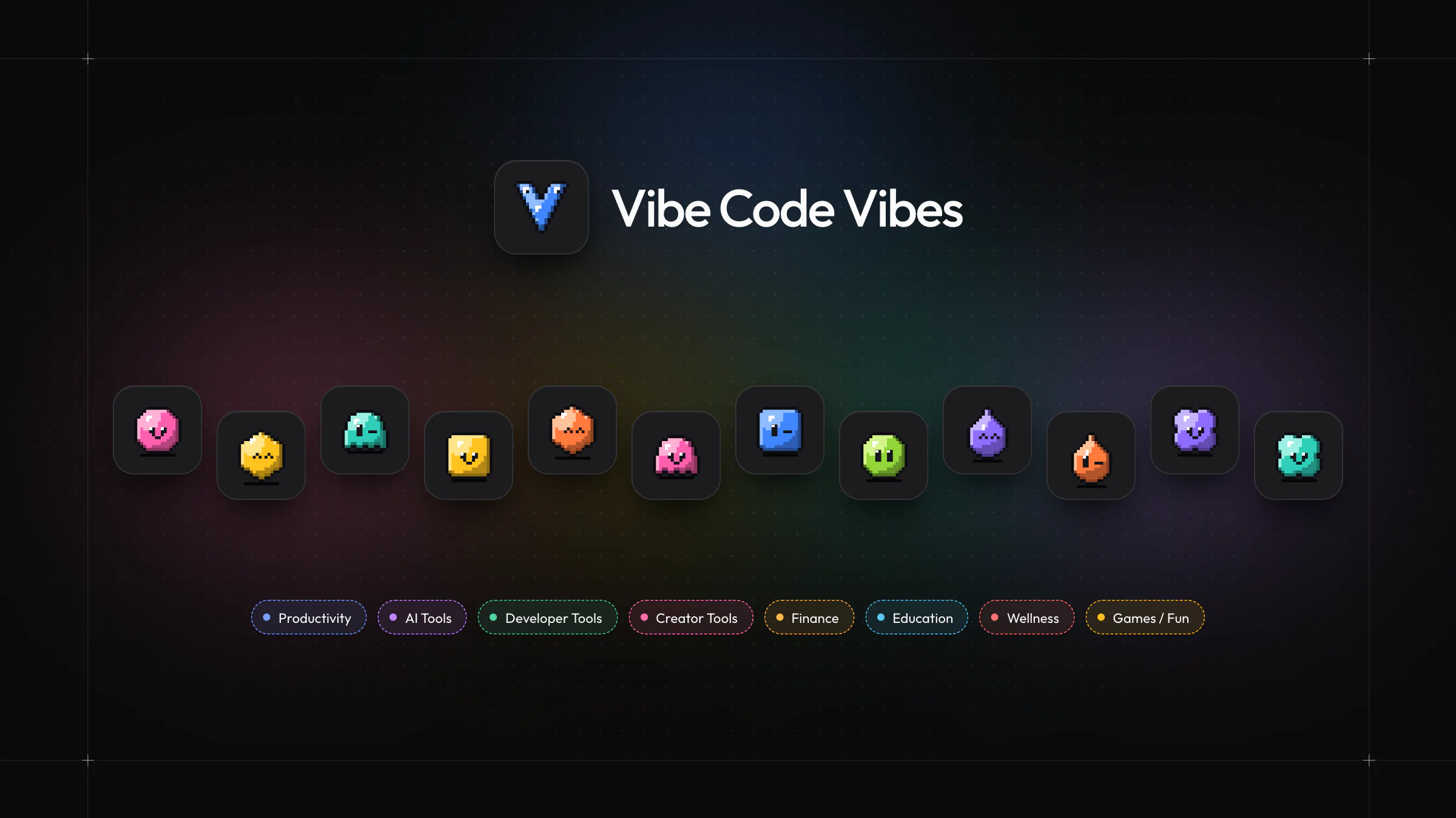
A system, not just a logo.
The characters give ideas, projects, and profiles a face, and every category has its own color. The same palette labels pills, tiles, and status markers on every page.
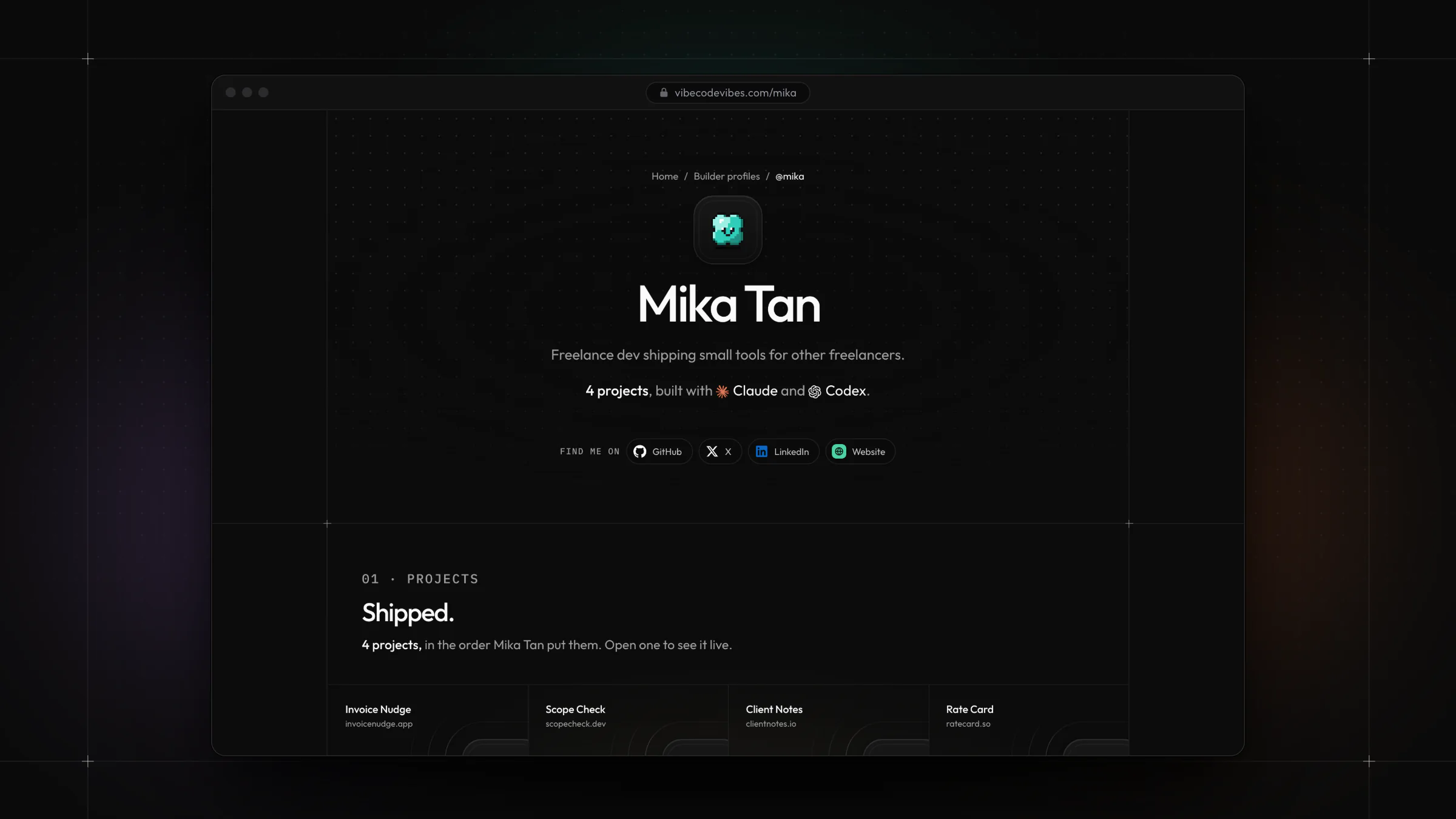
The brand in user content.
Public builder profiles carry the identity into pages people make themselves: a chosen character, shipped projects, the AI tools they use, and social links.
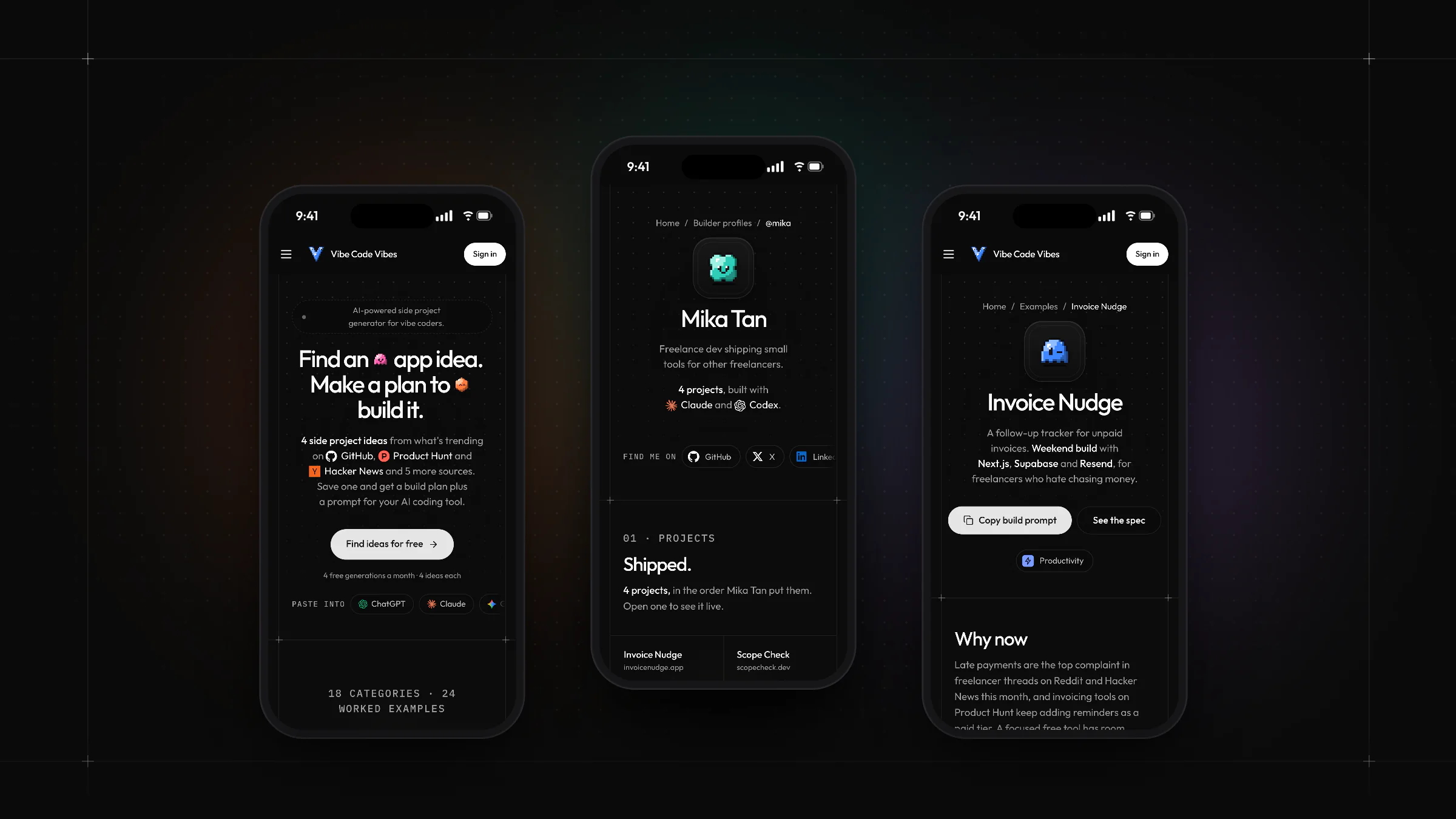
Consistent at every size.
The marketing pages keep their grid lines, characters, and type hierarchy on phones, so the brand reads the same wherever someone first meets it.
• Development
One builder,
no hand-offs.
I developed the full stack myself, which meant design decisions never got lost in a hand-off. The same person who drew the loading screen wired up the AI calls behind it, and the website and workspace share one codebase.
- 01
Next.js and TypeScript
The website and web app share one Next.js codebase written in TypeScript, styled with Tailwind CSS and built on accessible Radix UI components, deployed on Netlify.
- 02
Supabase back end
Supabase handles sign-in, the Postgres database, and profile photo storage. Row-level security keeps each person’s ideas and projects private to their account.
- 03
AI generation
Server-side edge functions call Anthropic’s Claude API to write ideas, build plans, and specs, and a usage check keeps every account within its monthly limit.
- 04
Daily trend data
A scheduled job collects signals from GitHub, Product Hunt, Hacker News, Reddit, Dev.to, Hugging Face, npm, and PyPI every morning, so each idea can explain why it is timely.
- 05
Subscriptions
Stripe Checkout and the customer portal manage paid plans, with webhooks keeping each account’s plan and generation allowance in sync.
- 06
Characters drawn in code
The pixel characters are SVG sprites drawn on a 20 × 20 grid from a seed such as a project ID, so every idea gets a consistent face with no image files to maintain.
The walkthrough
From the first brief to the next step.
• Website design
Explaining an AI
product clearly.
AI tools can feel like a black box, so the marketing website shows rather than promises. Real example ideas reveal the structure of the output, a features page walks through the workflow, and a sources page explains where suggestions come from.
Every page uses the same grid, characters, and pill system as the product, so the website doubles as a preview of the interface people will use once they sign up.
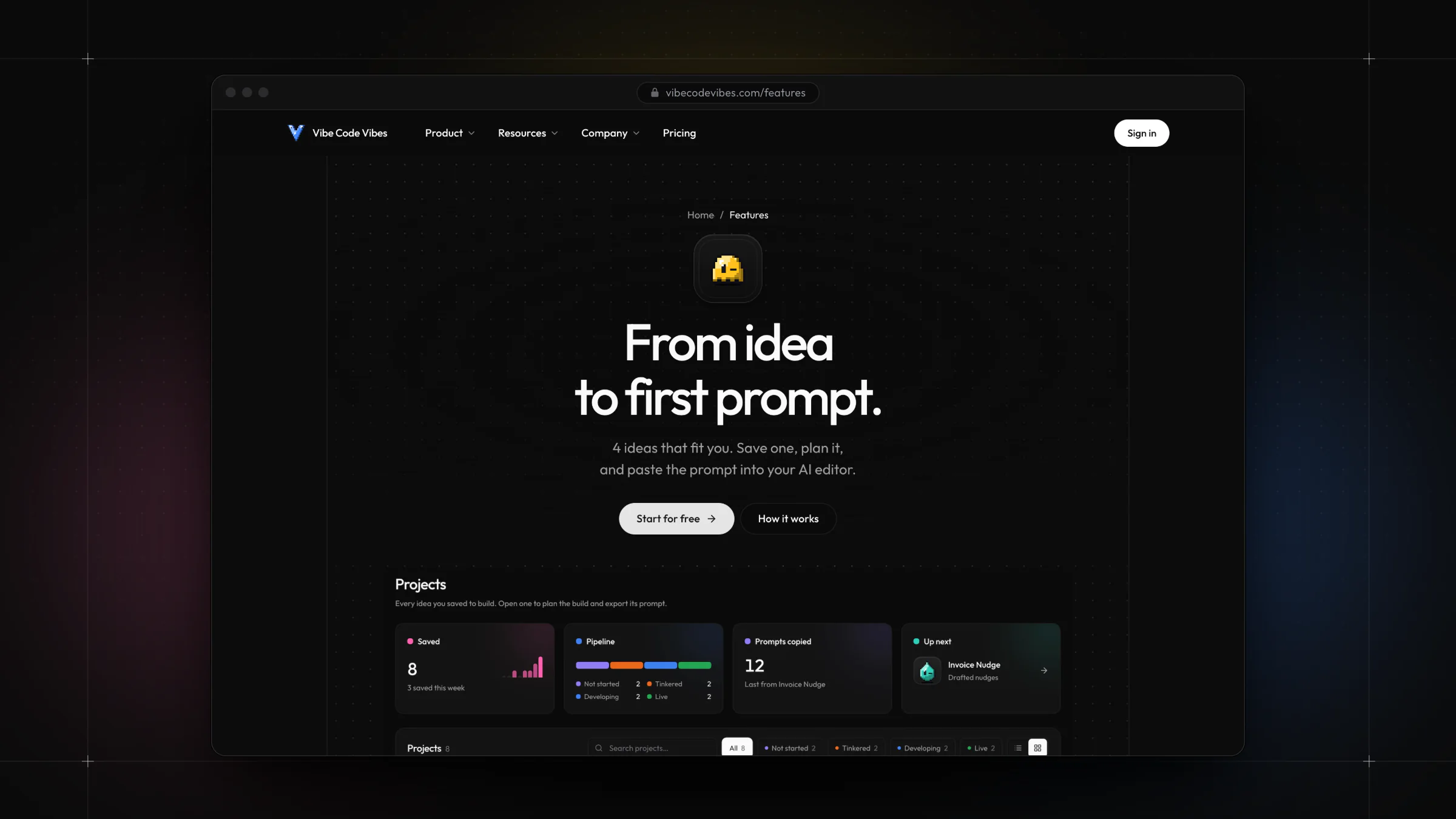
Product screens, not promises.
The features page explains the workflow in three steps beside real interface screens, so visitors understand the product before they create an account.
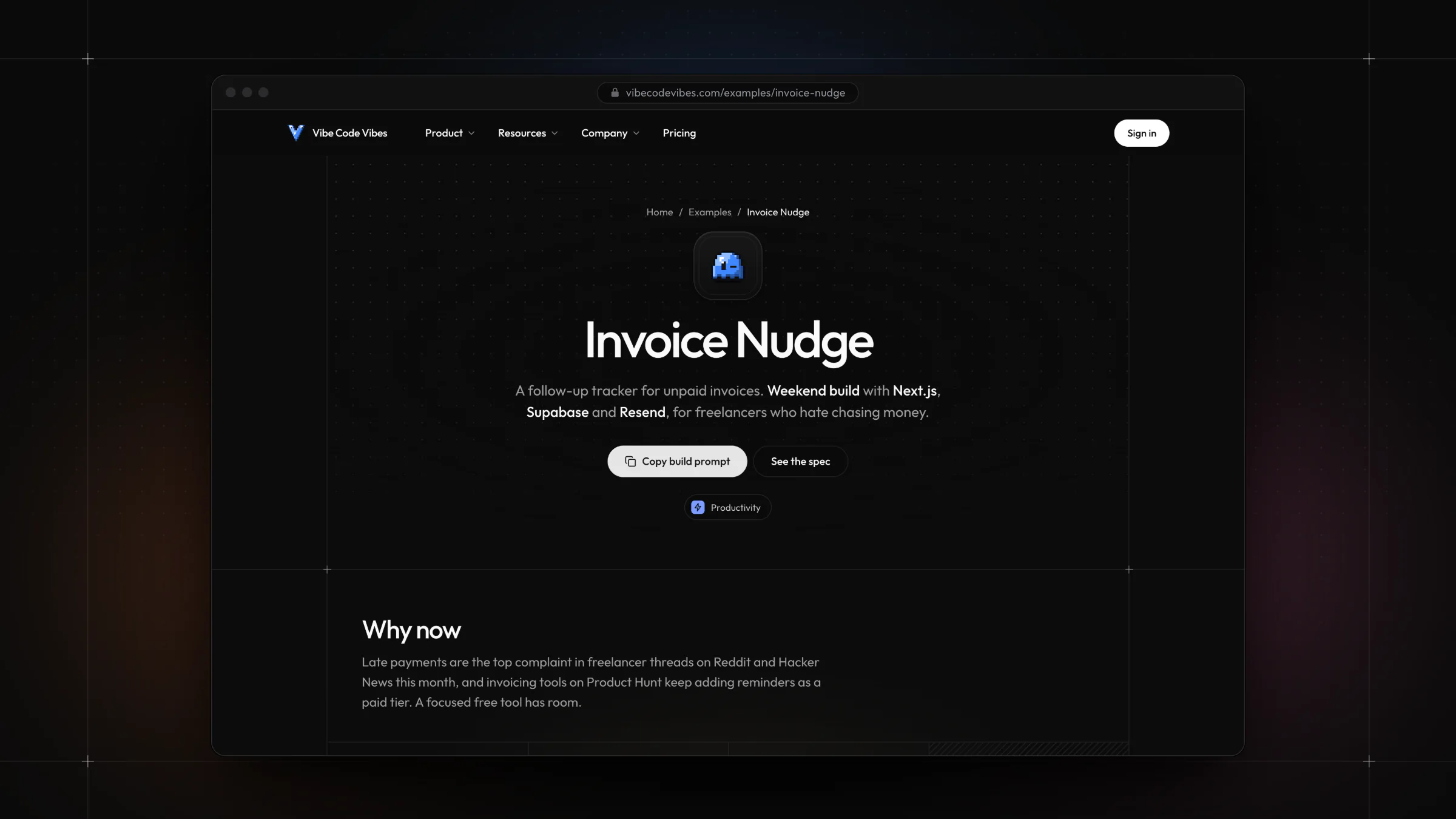
Examples that do double duty.
Twenty-four worked example ideas each show a full spec, build plan, and prompt. They make the output concrete and give the site a library of useful, indexable pages.
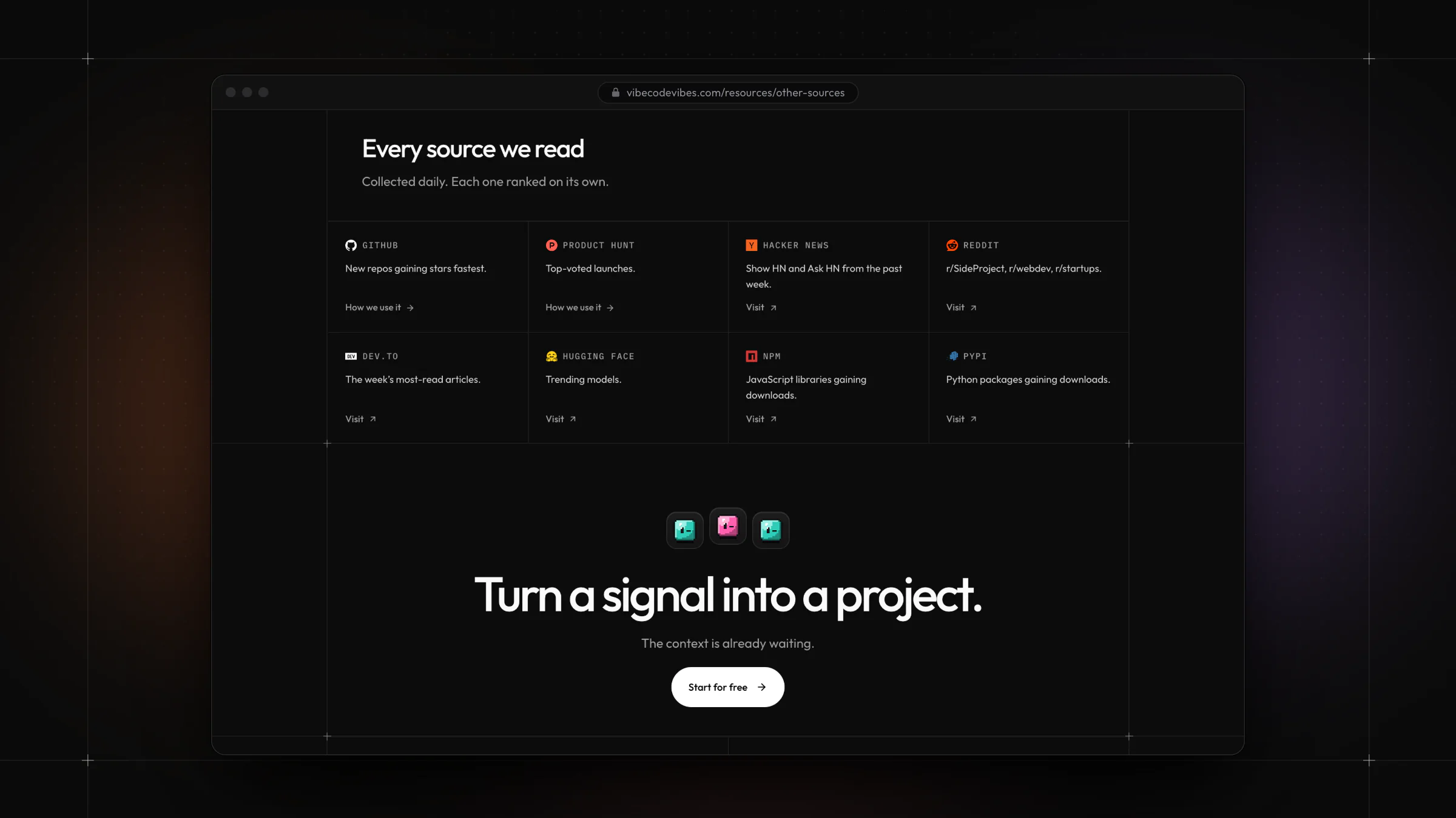
Building trust through transparency.
A dedicated page explains how developer conversations, product launches, and package downloads inform each suggestion. Showing the inputs makes the AI’s output easier to trust.
More of the project
The Vibe Code Vibes gallery.
What is Vibe Code Vibes?
Vibe Code Vibes is an AI-powered side project generator for people who build websites and apps. It suggests four project ideas based on someone’s interests, skill level, and available time, then helps them plan the one they choose.
What did Eight84 design and build?
All of it: the brand identity, including the pixel V logo and character system; the marketing website; and the signed-in web application, from UX flows and interface design to front-end and back-end development, AI integration, and payments.
What was the main UX challenge?
Making an open-ended AI tool feel approachable. The answer was to replace a blank prompt with small, guided decisions, keep results to four comparable options, and make each AI step explain itself, from the loading screen to the sources behind every idea.
What technology is it built with?
Next.js, TypeScript, and Tailwind CSS on the front end; Supabase for authentication, the Postgres database, storage, and edge functions; Anthropic’s Claude API for generation; Stripe for subscriptions; and Netlify for hosting.
Can Eight84 design and build a web app like this for my business?
Yes. I take products from idea to launch, covering brand identity, UX and interface design, and full-stack development. If you have a web app or website in mind, get in touch through the contact page.
More from Eight84.
View all projects
Looksy
An AI branding platform that connects a creative brief with a visual identity.
Reelish
A playful website and recipe dashboard with a shared brand identity.
Have a web app in mind?
Let’s make the idea clear and the product useful.